

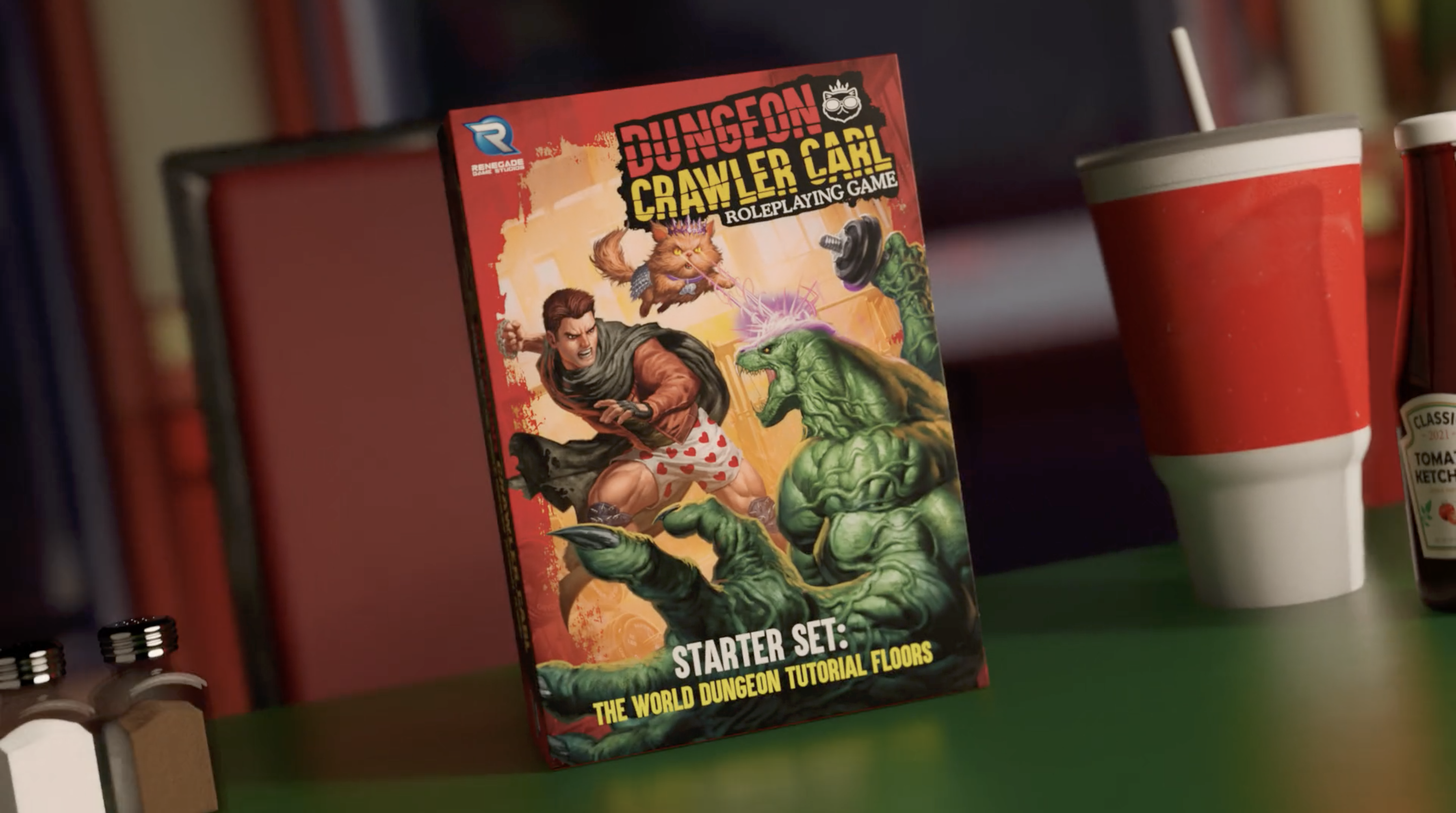
Turnkey branding service
Every Branding engagement is staffed from a single team. Strategy, naming, identity and design sit together, so the name, the mark, the story and the box all arrive agreeing with each other.
Naming
Names for companies, products, titles and product lines. Developed in volume, narrowed against real criteria, and handed over screened enough to take to your attorney without wasting their time.
Brand Design
Logos, marks, type, color and the visual language around them. Built to survive a one-inch spine, a thumbnail, an embroidery file and a fifty-foot banner.
Positioning
What you are, who it’s for, why it’s different and how it sounds saying so. The messaging framework everything else on this page gets written from.
Governance
Brand guidelines, asset libraries and usage rules, so your team, your freelancers and your licensees all produce work that looks like it came from the same company.
Collateral
Packaging, sell sheets, pitch decks, print and the physical materials your brand actually arrives on.
Graphic Design
Key art, campaign page design, ad creative and the asset systems behind a launch. The pieces that carry the identity into the loud parts of the year.
A shelf, a storefront and a feed are the same place. Somewhere your product has three seconds to explain why it exists.
Most brands in this space were named in a group chat and got their logo from whoever was cheapest that month. It made sense at the time. Then the thing works, and every decision made in twenty minutes three years ago is now load-bearing. The name nobody can spell. The mark that dies at thumbnail size. The description that changes depending on who’s writing it.
Branding is what does the explaining when you’re not in the room, which is almost always. On a retailer’s shelf, in a search result, in a screenshot somebody posted. You don’t get to add context. What you get is a name, a mark and a few words, doing the entire job.
So we build it as a system rather than a logo. Positioning first, because a mark can’t fix an unclear story. Then naming, identity and the governance that lets your team use it without calling us. A brand your people can actually run is worth more than a beautiful one they’re afraid to touch.
And we pressure-test it on real surfaces. Because this studio also makes the films, the renders, the packaging and the sites, your identity gets tried against the places it has to live before you commit to it, not after.
Here are a few real world applications.
The options are endless. We solve problems with design, animation, and technology.
Brand Mark
A distinctive logo built to stand out on a crowded shelf and a busy campaign page.
Branding Guidelines
Colors, type and rules in one tidy system so every asset looks like it belongs to you.
Catalog / Line Sheet
A clean, ordered sheet that makes wholesale ordering effortless for buyers.
Conference Booth Design
A booth that pulls foot traffic and makes your product the one people photograph.
Crowdfunding Page Design
A campaign page art-directed to hold attention from headline to pledge, matched to your video.
Packaging Design + Dieline
Shelf-ready box design with production-perfect dielines your manufacturer will love.
Pitch / Sales Deck
A persuasive deck that gets retailers, investors and partners to say yes.
Press Kit / EPK
Everything press and creators need to cover your launch: assets, copy and key art in one place.
Cover Design & Series System
A cover that works at thumbnail and a system that keeps book seven looking like book one without repeating it.
Interior Layout & Typesetting
Pages that read well for four hundred of them, with the front and back matter handled properly.
Retailer & Library Sell Sheet
The one-page pitch a buyer or acquisitions librarian actually uses to say yes.
Special Edition & Deluxe Packaging
Slipcases, foils, sprayed edges and inserts designed to justify a price that makes sense of the print run.
Convention & Experiential Activation
Booth, signage, wayfinding and the photographable moment that puts your property in everyone's feed.
Franchise Identity & Title Treatment
The mark and type system for a property, drawn to work at billboard scale and as a streaming tile.
Merch & Licensed Product Design
Product design and packaging that reads as canon rather than as a vendor's interpretation of it.
Buyer Pitch Deck & Sell Sheet
The one-page and the twenty-minute version, built for a category buyer who has eleven other meetings.
Compliance-Ready Artwork
Panels, claims, allergens, barcodes and dielines prepared to your co-packer's template, not redrawn after rejection.
Menu & Hospitality Collateral
For brands with a physical location. Menus, signage, cups and the printed pieces customers hold.
Sampling & Event Kit
Booth, uniforms, signage and handouts for demos, farmers markets and trade shows.
Box & Component Design
Shelf-ready box art and components that look as good as the game plays.
Playmat & Accessory Design
Playmats, tokens and accessories that turn a good game into a collectible.
Rulebook Layout & Design
Clear, on-brand rulebooks and reference sheets that are genuinely easy to follow.
Insert, COA & Packaging Extras
Certificates, numbered inserts and the small printed pieces that make an object feel collectible rather than bought.
Retail POP & Display Design
Endcaps, shippers, headers and pegboard furniture designed to earn the placement and hold it.
Community Hub & Discord Branding
Icons, banners, roles and rules design for the place your players actually live.
Key Art System
Hero art, character sheets and the rules for cropping them, so year two looks like year one.
Steam Page & Capsule Art
The capsule set, page layout and screenshots, built to read at every size Valve crops you to.
Pledge Manager Design
A pledge manager and checkout that makes add-ons and fulfillment painless.
Amazon A+ / Storefront
An A+ listing and storefront built to convert browsers into buyers.
Logo Animation / Brand Sting
A short, memorable mark animation that opens every video and signs off every reel.
Map & Illustrated Companion
Maps and illustrated companions that pull readers deeper into your world.
Why teams pick our Branding
Name through packaging, one team
Positioning, naming, identity, guidelines and the printed pieces from a single in-house crew, so nothing gets lost handing off between four vendors with four opinions.
Tested on the surfaces it has to live on
We make the films, renders, packaging and sites too. Your identity gets tried against real applications before you commit, not discovered to be a problem six months later.
Built for people who aren’t us
Guidelines, components and asset libraries your team can run without a phone call. A brand nobody dares touch quietly stops being used.
Made to be noticed, not just admired
The goal is getting picked up on a crowded shelf and recognized in a feed. Awards are fine. Being chosen is the job.
We’ve tailored our solutions to your industry.
Tabletop & Hobby Games
Game identities · Box design · Key art→02Video Games
Title logos · Store art · Press kits→03Toys & Collectibles
Line naming · Packaging · Retail assets→04Books & Publishing
Series identity · Cover systems · Imprint branding→05Food & Beverage
Packaging · Labels · Retail collateral→06Entertainment
Franchise identity · Style guides · Licensing assets→Estimate your Branding project.
Build a transparent estimate in about 60 seconds. Our calculator returns a price estimation so you know what to expect before we get started.
Open the calculator →Frequently asked
Single pieces like a logo or a campaign page have set tiers you can price instantly in the calculator. Full identity work runs as a range, roughly $1k to $50k+ depending on scope, and we firm it up after a short scoping chat.
Yes. The page that lives inside Kickstarter or Gamefound is mostly narrative, art direction and layout, which is branding work in a platform’s clothing. The pre-launch landing page, the FAQ hub and the late pledge store around it are Experience Design, and the same studio makes sure they match.
No. Rebrands, line architecture, guidelines and packaging refreshes happen in the middle of an ordinary year, usually because something outgrew its original decisions. A launch is a common reason to call, not a requirement.
Yes. A series identity, a cover system and an imprint mark are the same problems with different nouns. Same for toy lines, education programs and entertainment properties. What changes is the shelf, not the work.
Often, yes. Plenty of engagements start at packaging, key art or guidelines and leave the mark alone. We’ll say so honestly if the existing identity can’t carry what you’re asking it to do.
No, and be careful with anyone who says otherwise. We screen candidates hard enough that your attorney isn’t billing you to reject obvious problems, then you file with counsel who does this for a living.
Source and export files in every format you’ll need, a guidelines document your team can hand to anyone, and a walkthrough so the handover isn’t a zip file and good luck.
Naming and single-piece work move in a few weeks. A full identity with positioning and guidelines typically runs six to ten weeks. You’ll get a dated schedule during scoping and we’ll flag anything that threatens a date you’ve already announced.